Even before a person has time to read a word, the brain has already made a conclusion whether to trust the brand, whether to like the product, whether to stay on the site. Research shows that up to 90% of instant judgments are based on color. Visual stimuli are more influential than logic, than words, than price. Emotion is embedded in them, and it is this emotion that drives the buyer.
Emotion Behind The Shade
Red triggers an action. It accelerates the pulse rate, creating a sense of urgency. The conversion rate of CTA buttons increases by 21% when this color is used. But the overabundance makes the interface aggressive. Blue, on the contrary, inspires calmness, trust, and a sense of reliability. It’s not for nothing that 87% of brands seeking to build trust use blue in their identity.
Yellow glows with energy and optimism, but in bright colors it irritates the eyes. Green is a symbol of balance and growth, a symbol of confidence and nature. It reduces anxiety and stimulates purchase decisions, especially in financial and eco-friendly projects.
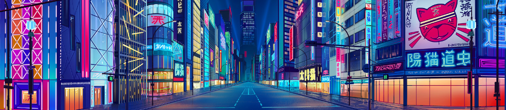
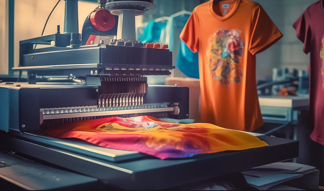
Orange infects with energy, creates a sense of friendliness, and black adds power, status, and depth. White gives purity and space, gray balance and neutrality. Each shade doesn’t just decorate it channels emotion. For creative industries and visual branding, including DTF printing, the right tone can transform ordinary graphics into emotional storytelling that sells without words.
Perception Hierarchy And Design
The contrast decides where the person will look first. Black text on a white background reads 70% better than any low-contrast combinations. In interface design, this principle enhances attention and reduces decision-making time.
There is a proven perception formula: 60-30-10. The main color is 60% of the space, the additional color is 30%, and the accent color is 10%. This creates visual harmony, reduces cognitive load and helps the eye to rest. This balance increases user retention by 28% and reduces bounce rate by 27%.
High-contrast buttons and active elements receive 23% more clicks, and interfaces with a thoughtful color scheme increase the average session duration by 34%.
Color As A Language Of Trust
The brain reacts to color 25 milliseconds before the shape. This gives the brand significant advantages. The constant use of one palette increases recognition by up to 87% and strengthens emotional connection. People remember the shade without even realizing it.
If the CTA is colored red, the conversion rate increases. If it is blue, the feeling of security increases. And when color identity is maintained across all platforms, customer retention increases by 23% and engagement by almost a third. Color becomes a part of trust, a symbol of stability.
Color And Perception On Mobile Devices
The colors behave differently on the phone screen. Research shows that increasing contrast by 35% makes content 28% more readable in daylight. An automatic color temperature adaptation of warm tones in the evening, cold in the morning increases evening engagement by 31%.
It must be remembered: 1 out of 12 men cannot distinguish between certain colors. Therefore, the design must comply with WCAGstandards. The minimum contrast of the text is 4.5:1, otherwise the interface loses readability. Available solutions increase user satisfaction by 42%.
Color And Measurable Efficiency
Color psychology is not a theory, it is a metric.
- Changing the color of the button increases the conversion rate by 23%.
- Contrast correction reduces bounce by 18%.
- A new shade of error messages increases form completion by 27%.
When the ROI reaches 1400%, there is no doubt: the emotional reaction is converted into real numbers. The right color becomes part of the strategy, not just a style element.
Color As An Emotional Brand Code
Each shade forms a story. It works on the level of instinct, ahead of thought. Red calls for action. Blue says: “Trust me.” Green whispers: “You’re safe.” Black promises strength, white purity, orange movement forward.
In a world where attention lasts a fraction of a second, color remains the fastest way to tell the main thing. It doesn’t just decorate the design, it manages emotions, behavior, and decisions. A color chosen consciously can sell without words, just as a perfectly balanced hue in direct to film printing can turn a simple image into a memorable impression that connects emotionally with the viewer.
Hockey fan, nature enthusiast, hiphop head, Eames fan and HTML5 Guru. Doing at the junction of aesthetics and programing to create great work for living breathing human beings. I work with Fortune 500 companies and startups.